Organizational chart template
Map your company hierarchy from a ready-made template. Edit levels, departments and roles in your browser, then export to PDF, PNG or PowerPoint.
A complete company structure, ready to edit
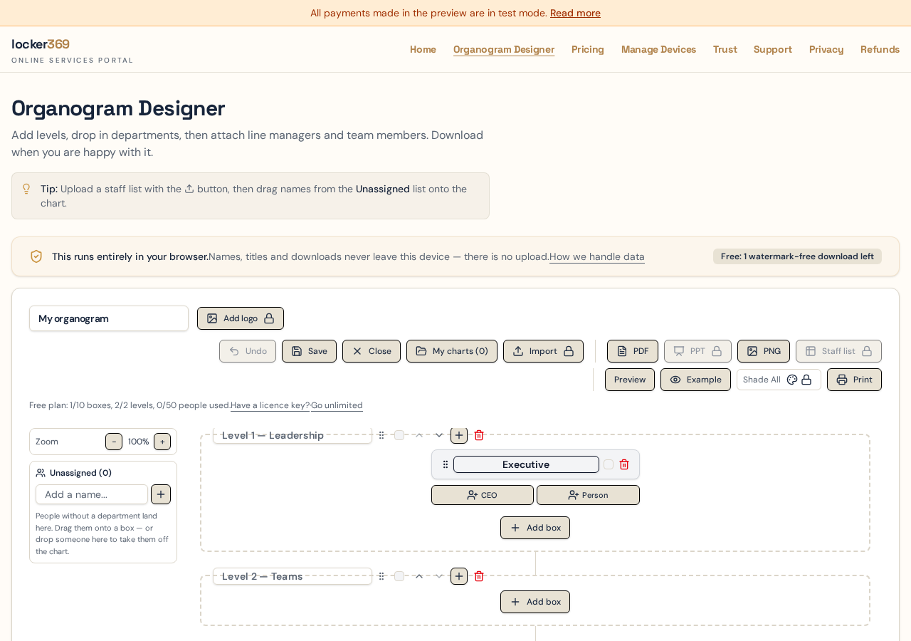
The template includes a typical organizational chart layout you can adapt to any business. Replace sample names, add departments, and adjust reporting lines until it matches your company.
Executive level with CEO, COO, CIO and other leadership roles.
Management layer with department heads and line managers.
Team-level boxes for individual contributors and reporting lines.
Shared services band for HR, IT, Finance and other support functions.
Four organizational structures, and when each one fits
Before you draw boxes, decide which shape your business actually has. Choosing the wrong one is the most common reason a chart gets drawn, circulated once and then quietly ignored.
Hierarchical
A pyramid: one leader at the top, widening through managers to front-line teams.
Best for
Established companies with defined functions — manufacturing, financial services, government and most businesses over 100 people.
Strengths
- Everyone knows who their manager is
- Clear promotion and grading paths
- Matches how payroll and HR systems are already set up
Watch out for
Decisions slow down as layers multiply, and information gets filtered on the way up. Count your layers: more than four or five between the CEO and a front-line employee is usually a sign to flatten.
Flat
Two or three bands only: founders or leadership, then teams with very little middle management.
Best for
Startups, agencies and professional teams under roughly 50 people where everyone is close to the work.
Strengths
- Fast decisions and short feedback loops
- People take on broader responsibility
- Cheap to run — fewer management salaries
Watch out for
Span of control gets unmanageable as you grow, and career progression is hard to show when there are no rungs on the ladder. Most flat organisations add a layer somewhere between 30 and 60 people.
Divisional
The business splits into semi-autonomous divisions by product, region or customer segment, each with its own functions.
Best for
Multi-product or multi-country businesses where each market behaves differently.
Strengths
- Each division can be measured on its own results
- Local decisions are made by people close to the customer
- A division can be grown, sold or restructured without disturbing the rest
Watch out for
Functions get duplicated — three divisions can end up with three separate marketing teams. Show shared services explicitly so the duplication is visible and deliberate.
Matrix
A grid: functional managers run down the page, project or division leads run across it, and most people answer to both.
Best for
Project-driven businesses — consultancies, engineering firms, IT delivery organisations.
Strengths
- Specialists can be moved to wherever the work is
- Projects get dedicated leadership without breaking up functional teams
- Utilisation of scarce skills improves
Watch out for
Two bosses means conflicting priorities unless the split is written down. On the chart, keep the solid line for the functional manager and use dotted shared-service lines for the project relationship, so it is obvious which one owns performance reviews.
How to build a company organizational chart
A structure is easier to get right when you settle the layers before you start naming people. This order keeps the debate about design rather than about individuals.
- 1
List your leadership team first — these become Level 1. Keep it to the people who genuinely sit at the top table.
- 2
Write down every function the business performs, then merge the ones that share a budget or a manager. That merged list is your set of Level 2 department boxes.
- 3
Assign each person to exactly one department. Anyone you cannot place goes to the Unassigned list rather than into an approximate box.
- 4
Nominate the head of department for each box, then the line manager beneath them. If a box has no manager, that is a finding worth raising, not something to invent.
- 5
Add sub-departments where a function reports into another function rather than to the executive.
- 6
Mark shared-service people last, once the primary structure is settled, so dotted lines don't hide a missing solid one.
- 7
Preview in landscape, check nothing is cut off, then export the PDF and circulate it for correction before you call it final.
Org chart terms explained
- Level
- A horizontal band of the chart. Level 1 is normally the executive team, Level 2 the departments. Levels set the vertical order of the whole diagram.
- Department box
- A grouping that holds a head of department, a line manager and team members. Boxes sit side by side within a level and wrap onto a new row once a level gets wide.
- Head of department (HOD)
- The person accountable for a function. Shown at the top of the department box, above the line manager and team.
- Reporting line
- The connector between two boxes. A solid line is the primary management relationship; a dotted line is a secondary or advisory one.
- Sub-department
- A department that reports to another department rather than to the executive layer. It is drawn centred below its parent with a solid connector.
- Shared service
- A person or function supporting several departments at once — HR, IT and Finance business partners are the usual examples. Shown once, linked to every team they serve.
- Span of control
- The number of people reporting directly to one manager. Wide spans suit routine work; narrow spans suit complex or high-risk work.
- Unassigned list
- A holding area on the left of the designer for people you have added but not yet placed. Useful mid-restructure when roles exist before their home does.
Built for company org charts
Company-ready layout
A hierarchy that works for startups, agencies and enterprises alike.
Board-ready exports
PDF and PNG are free; PowerPoint export is available on Pro plans.
Sensitive data stays local
Employee names and roles are never uploaded. The chart lives in your browser.
Frequently asked questions
What is an organizational chart?
An organizational chart, or organogram, is a diagram of who works where and who reports to whom. It shows the layers of a business from the executive team down, groups people into departments, and draws the reporting lines that connect them.
What are the four main types of organizational structure?
Hierarchical, flat, divisional and matrix. Hierarchical has many layers and a clear chain of command; flat removes middle management; divisional splits the business by product, region or customer; matrix gives people two reporting lines, usually a functional manager and a project or division lead.
How many levels should an organizational chart have?
As few as your decisions allow. Under 50 people, two levels is usually enough — leadership and departments. Between 50 and 250, three levels lets you show heads of department and their line managers. Beyond four or five levels a single chart becomes unreadable, so it is better to publish one company-wide chart and a separate detailed chart per division.
What is a dotted-line or shared-services relationship?
It is a reporting relationship that isn't the person's main line manager — an HR or Finance business partner who sits in a support function but works day to day inside another team. On the chart these people appear in more than one department box, connected by colour-coded dotted lines, instead of being duplicated as separate people.
What is a sub-department?
A department that reports into another department rather than straight up to the executive layer — for example Payroll sitting under Finance. Drag one department box onto another and choose Sub-department, and the child box moves below its parent with a solid connector joining them.
What is span of control, and what is a healthy number?
Span of control is how many people report directly to one manager. There is no universal right answer, but five to nine direct reports is a common working range for supervisory roles; routine, similar work supports a wider span, while specialised or high-risk work usually needs a narrower one. A chart makes an unbalanced span obvious at a glance.
How often should the chart be updated?
Review it whenever people join, leave or move, and do a full check at least quarterly. Because charts here are saved in your browser, Save As lets you keep the current published version intact while you draft the next one.
Keep reading
- Org chart template — four copy-ready structures and the three-column spreadsheet format.
- Free org chart maker — build one step by step without signing up.
Build your organizational chart now
No signup required. Open the template, edit your company structure, and export when you are ready.